Previously, we discussed the importance of setting up powerful workflows for dealing with abandoned carts in WooCommerce. Automating abandoned cart workflow by employing an abandoned cart email template is an effective way to reach out to our customers to deliver simple, friendly reminders to finish checking out. As shopkeepers, we’re aiming to complete the WooCommerce buying cycle. There’s no more effective way to complete the buying cycle than reaching out to interested parties who have already shown intent.
➡️ Don’t you know what makes a good abandoned cart email? The options for creating a good email are endless, and depending on the type of shopkeeper you are, intimidating. But never fear!
There are plenty of template choices out there for comparison that we can reference. The most important thing we want to ensure our abandoned cart emails are delivered engagingly and compellingly. To do that, we should be able to break down the different elements in abandoned cart emails that separate a good email from a bad one.
The good news is that it’s almost impossible to hurt your store and sales by implementing an abandoned cart email template (apart from spamming). With that in mind, first, I will show you the different elements that can separate bad emails from good ones. Then we’ll take a look at separating good abandoned cart emails from great ones. Let’s begin🚀!
Table of contents
- Make your abandoned cart emails opened by customers
- Tone: Choosing the right one for your abandoned cart email template
- Copy and images: The importance of good copy or good images
- Call to action: Getting people to finish checking out
- Navigation: What other links to use in your abandoned cart email template
- ShopMagic: Abandoned Carts add-on – a free plugin for WordPress and WooCommerce
- Summary & more about ShopMagic
The subject/title: Getting your abandoned cart emails opened by customers
In the modern age, we’re bombarded by communication all day. Whether it’s personal email, work email, social media, or chat applications, it feels like someone is constantly trying to reach us. How many emails do you get in a day? How many of those are marketing or sales pitches? Due to time constraints and prioritizing, most people scan their emails briefly for important emails and ignore everything else. Everything else ends up archived, unread, and unloved.
Open up your email and scan up and down the list. Are there any sales or marketing pitches that catch your eye in particular? Consider what sort of titles would make you more or less likely to open a marketing email.
A list of interesting titles
You may end up with a top-four list like this:
- Legitimate: From a known brand or company, the subject is clear, not spam.
- Arouses Interest: New developments, giveaways, product information, etc. in an area of interest.
- Provides Value: Discounted or free products, news about a future large sale, personalized marketing content.
- Creates Urgency: Time sensitive and requires action.
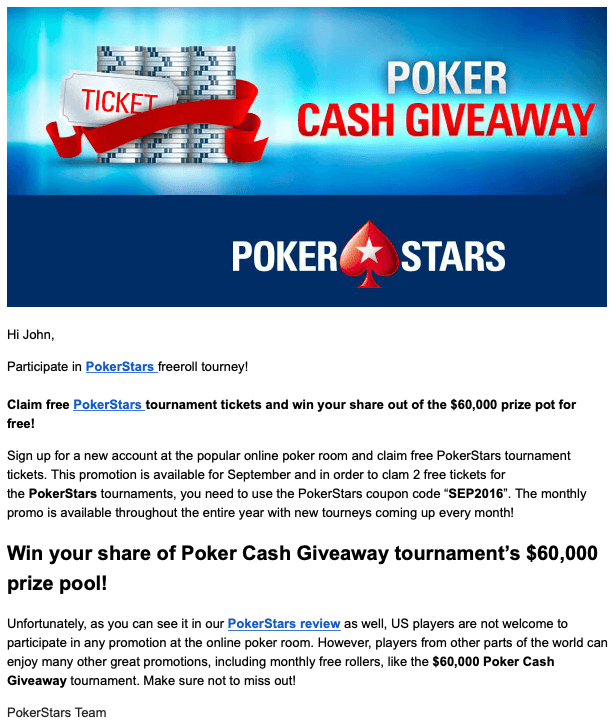
♠️ PokerStars ♥️ did a great job of email marketing in this case. I immediately know the sender is legitimate, I like poker, and value is being offered in the form of free tournament tickets. The giveaway shows me a monetary value creating urgency. I want to get my ticket before they’re done with their giveaway.
I know, I know. You’re thinking, “Why are you telling me what I already know? Tell me about creating a good subject line for my abandoned cart email template!”
Tone: Choosing the right one for your abandoned cart email template
The tone is an important part of written communication. Consider the two following sentences:
First example
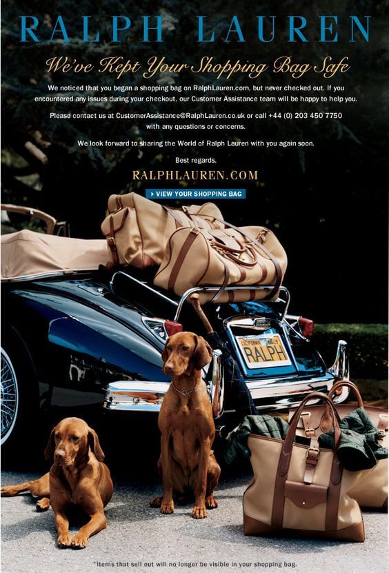
The first example sentence is friendly. By implying that they have our back, the sender of this abandoned cart email (Ralph Lauren) is creating a relationship with the reader that promotes positive feelings by the reader. But they don’t get too friendly with their tone.
Their subsequent lines revert to a professional tone by asking customers to email them if they encountered any issues. So we see the professional customer service nature of the relationship yet friendly and attentive with their attention grabber.
Furthermore, words aren’t the only thing in your written communications that display tone! Ralph Lauren’s email has a picture of two dogs guarding bags in preparation for a trip somewhere. This simple picture op tugs at peoples’ heart strings, stirring up memories of pets and trips. Of course, it’s not easy to measure the effectiveness of this picture in producing sales. But its emotional and friendly appeal is undeniable.
Second example
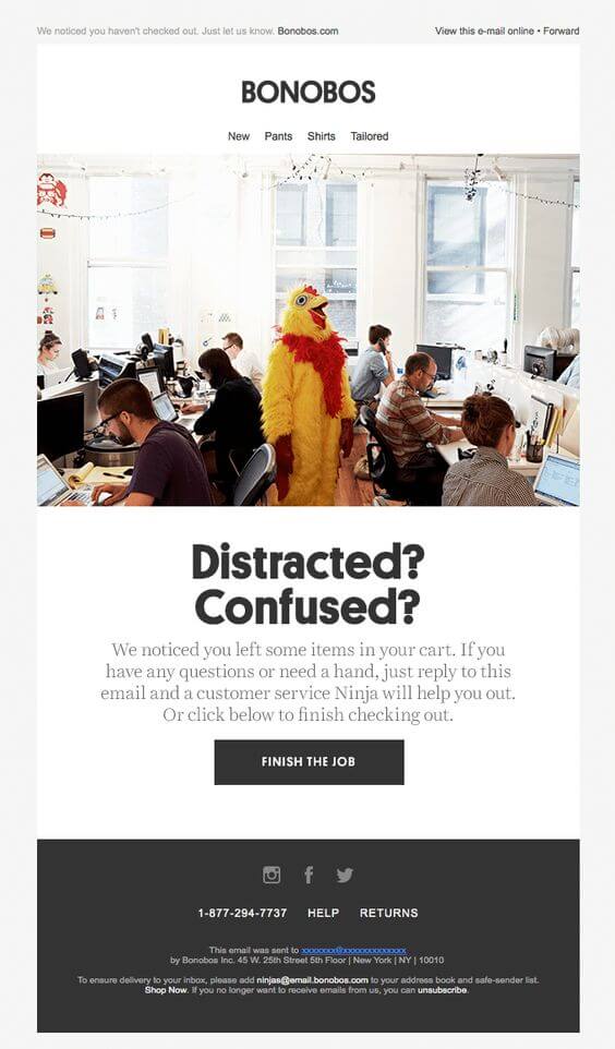
In contrast, the second example has a tone that is pompous and fairly arrogant. It assumes their customers are too dumb or have too short of an attention span to finish checking out. I think that the sender (Bonobos) has tried a little bit too hard to be funny, ending up coming off as insulting. Their second line is inviting and helpful, offering customer assistance by email, but this is ruined by their attention grabber.
Its picture also implies the customer is the chicken in the center of the room, clueless and surrounded by people sitting around an office.⚠️ There’s no friendly appeal here, and if a humorous tone was the goal, is completely ineffective. There’s no real rhyme or reason that this picture should even be in their abandoned cart email template!
Copy and images: The importance of good copy or good images
The examples that I’ve been using thus far have been ripe with clean, simple layouts full of images and simple copy. But that’s not the only way to write a good abandoned cart email. ⚠️ You can also go the old-fashioned route and use text if you’re not ready to incorporate an image layout.
👉 Good text copy will be essential at first setting up your shop’s abandoned cart email template. It’s your first step in the door, let’s make it count!
Good copy will attempt to be simple, inviting, employ the right tone, and be informational. Here are some examples of abandoned cart emails that can be referenced for producing your first abandoned cart email template. Of course, we’ll want to expand beyond this at some point, as time and resources allow.
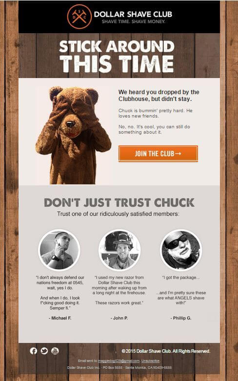
From an effectiveness standpoint, text copy on its own cannot compete with a good abandoned cart email template with images. People have short attention spans, and images can convey in one glance what words struggle to do in 100 (or more) words. Furthermore, properly organized abandoned cart email layouts exude a professional demeanor and authority. People’s first impressions when opening our abandoned cart email templates are extremely important. And words alone are insufficient to convey a strong one.
Along the road, it will be beneficial to create full, responsive layouts with powerful image design. For now, having a good copy will do!
Call to action: Getting people to finish checking out
While browsing abandoned cart email templates, you’ll find one aspect that all of them have in common. A call to action (CTA)! As shopkeepers, we want our customers to finish their checkout, and we want to make it easy!
A prominent CTA button may convert our abandoned cart email readers into satisfied buyers. Simple, right? Here are two more examples of abandoned cart emails that reinforce it…twice!
CTA examples
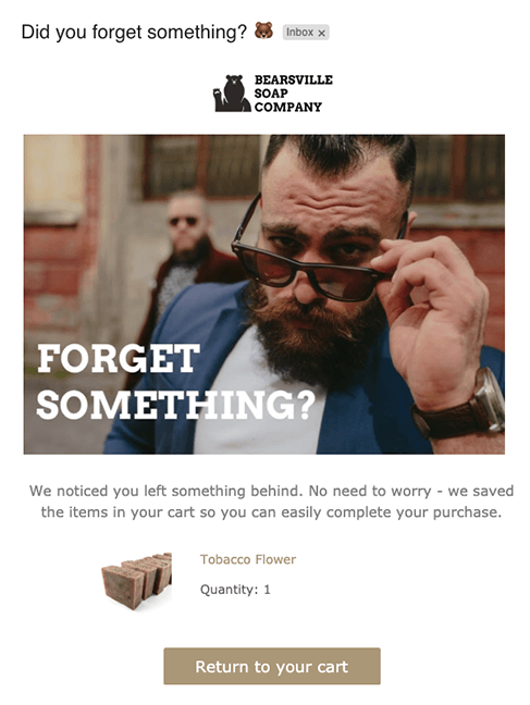
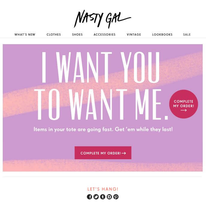
Both of these abandoned cart emails are pretty well done by any stretch of the imagination. They’re simple and easy on the eyes, yet they make their purpose pretty clear. The Nasty Gal ad even succeeds at creating urgency by stating that “Items in your tote are going fast.” By using tote as the chosen word for shopping cart, they’re making shopping online sound hip and cool. It may be appealing to their demographic.
The Ralph Lauren abandoned cart email also does a great job by offering other items that the customer may like. By doing so, they’re creating more opportunities for the customer’s interest to be aroused. Of course, the point is to attract a reader to visit the site again, even if they don’t complete their checkout. Great stuff!
To sum up: If it ain’t broken, don’t fix it…Or use it twice!
Of course, you can also narrow this down into specific calls to action. For example, offering personalized discounts that expire within 24 hours is a call to action that also incorporates a sense of urgency. Get creative! There’s no one right way to do this. But the accepted consensus is to have a call to action in some form or another.
Navigation: What other links to use in your abandoned cart email template
By putting our website’s normal navigational links on your abandoned cart emails, we can ensure that customers are at least subconsciously aware of the offerings in our shop. If their reason for abandoning their cart was a loss of interest in the product they intended to buy, we want to offer them a chance to peruse all of our other great stuff!
There are different strategies for incorporating our website’s navigational links on our abandoned cart emails. We want to avoid introducing too much clutter to the design while ensuring customers have easy access to the menu options if they so choose. The standard is to incorporate a menu / navigational bar at the top of the abandoned cart emails that are simplified down to broad categories. The goal is to get them back on our page, not to showcase everything we have on offer.
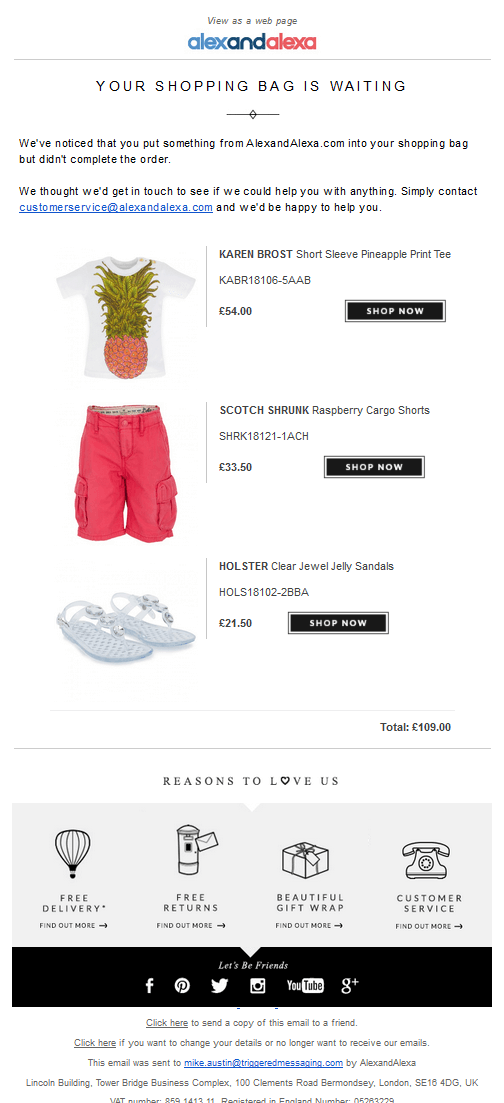
If you prefer to leave your navigational menu out of your abandoned cart email, another option is to present your email in a shopping cart appearance, with some additional offerings (non-product related) at the bottom of your email. The alexandalexa abandoned cart email displayed below is also a good example of this being done right.
ShopMagic: Abandoned Carts add-on and what it can do for you
WooCommerce abandoned cart email
WooCommerce is a great, essential tool to have for e-commerce shopkeepers all around the world. However, setting up and customizing emails for every category can be a daunting task if you’re unfamiliar with scripting languages such as PHP and HTML. ShopMagic simplifies the entire process of creating a custom email into a language that uses variables that are easy to comprehend and express ourselves in.
ShopMagic
Create the most effective WooCommerce abandoned cart email with ShopMagic.
Download for free or Go to WordPress.org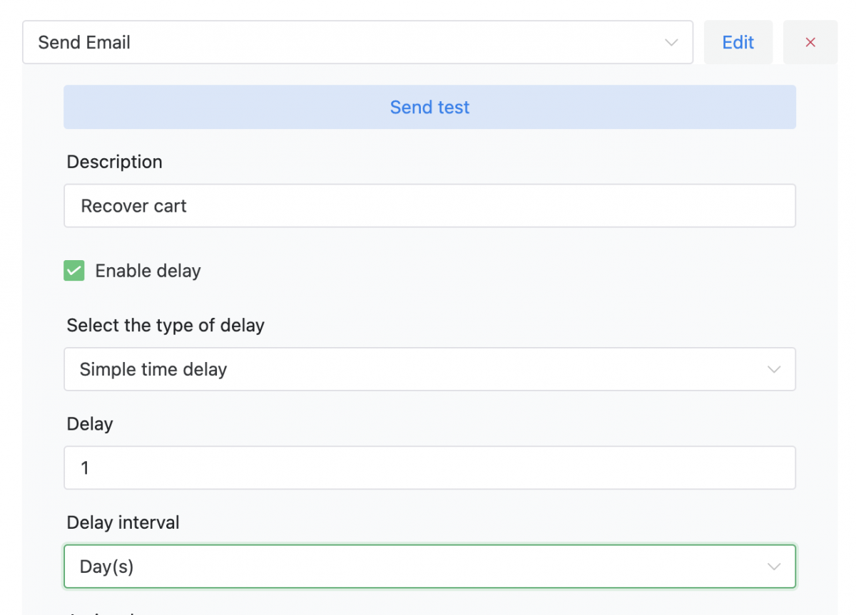
WooCommerce cart abandonment email template
Adding media (images) and structuring your emails has also been simplified, making it easier than ever to experiment with different email templates. The organizational system is integrated into the plugin directly on WordPress, making editing and organizing your emails a cinch. Whether you’re just trying to reach your entire customer base through promotional emails or segments of your customer base (high spenders, frequent shoppers, etc.), ShopMagic helps you draft that attractive email quickly and easily. Really!
ShopMagic
ShopMagic direct integration into WooCommerce ensures you’re able to collect valuable contact information (emails) about your customers so you have the opportunity to reach out to them if they abandon their carts. This provides marketing flexibility and ensures future lead generation and conversion opportunities. Every email we don’t send to customers with abandoned carts is setting money and opportunities on fire!
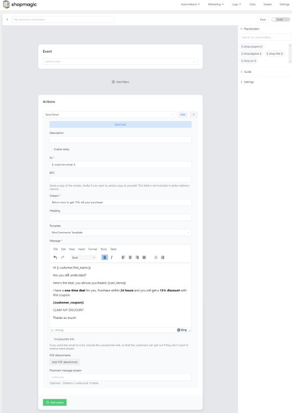
Read how to reduce the abandoned cart rate in WooCommerce for all customers. But what about future abandoned cart emails? If your abandoned cart strategy changes down the line to include multiple emails, then separate emails for separate time frames can easily be configured.
ShopMagic
Create the most effective WooCommerce abandoned cart email with ShopMagic.
Download for free or Go to WordPress.org👉 Once you have it, download the free add-on to reduce abandoned carts in WooCommerce!
Summary & more about ShopMagic
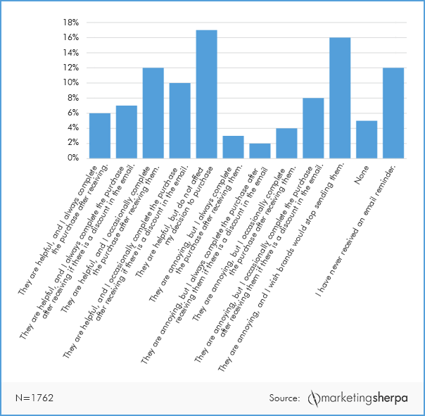
We strongly recommend viewing different abandoned cart emails to get an idea of what sort of subject line, copy, navigational layout, and images would be most attractive for your demographic. 51% of consumers in a MarketingSherpa study found abandoned cart emails to be helpful! Taking the 38% of people who found them to be annoying into consideration, setting limits on the frequency of reminders may be a wise strategical adjustment.
Of course, there’s always room to improve your abandoned cart email template and tune your strategy. There will always be opportunities to test different campaigns to see which ones are the most effective at producing conversions. For right now, we recommend taking your newfound knowledge and typing up a text copy of your WooCommerce abandoned cart email template!
Using ShopMagic, you’ll be able to use existing images from your e-commerce business and easily integrate them into producing your first abandoned cart email template quickly and easily. The integration into Mailchimp, Aweber, and WooCommerce will also guarantee you don’t miss another conversion opportunity. Get ShopMagic today!
ShopMagic
Create the most effective WooCommerce abandoned cart email with ShopMagic.
Download for free or Go to WordPress.org


